Rebranding
International Monetary Fund
Storyline
The following project is a rebrand of the International Monetary Fund as part of a re-branding project for the BFA Design program I was in at San José State University in the Spring of 2020. We had the choice of several intergovernmental organizations to choose from and I went with IMF.
The International Monetary Fund, or IMF, is an international organzation consisting of 190 countries working together to foster global monetary cooperation, secure financial stability, facilitate international trade, promote employment and sustainable economic growth, and reduce poverty around the world with the help and resources that the World Bank has to offer.
The final project lead up to the creation of a new logo/brand identity for IMF. The new brand identity was set to evoke a refreshed , vivid and energetic feel to IMF, with the integration of a dimensional equal sign to exemplify the tagline “Developing Sustainable Economies.”
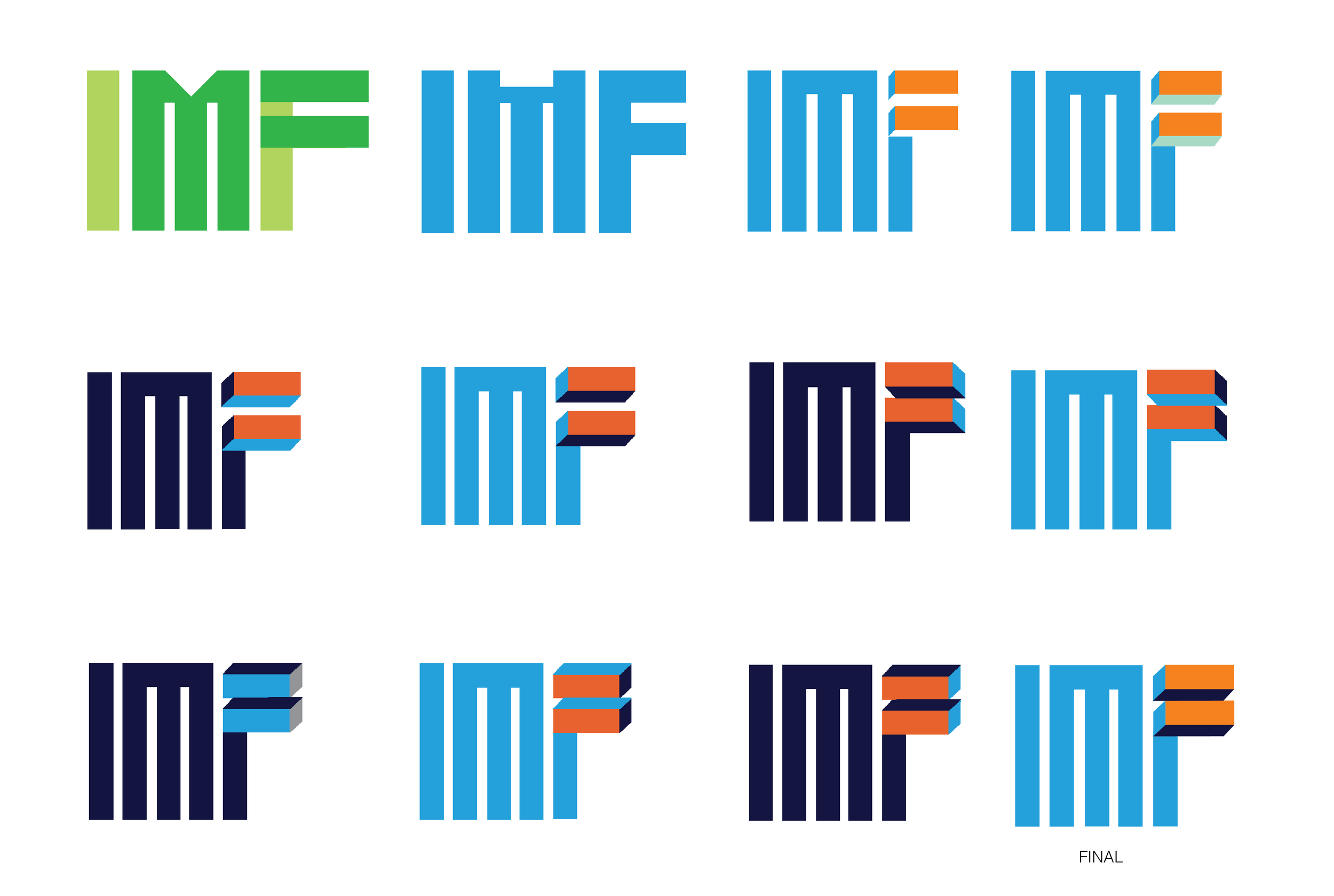
Initial Main Logo Sketches & Iterations
The project began with brainstorming concepts and visuals for the rebranding of IMF.
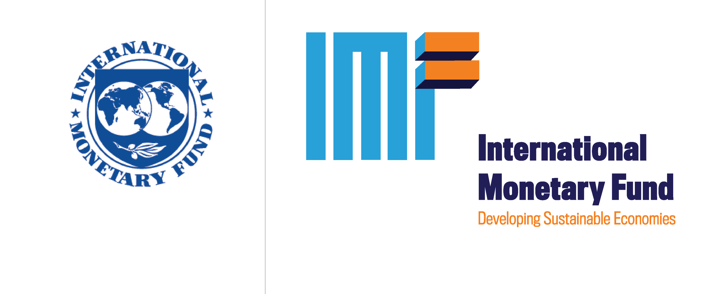
Old vs New Logo
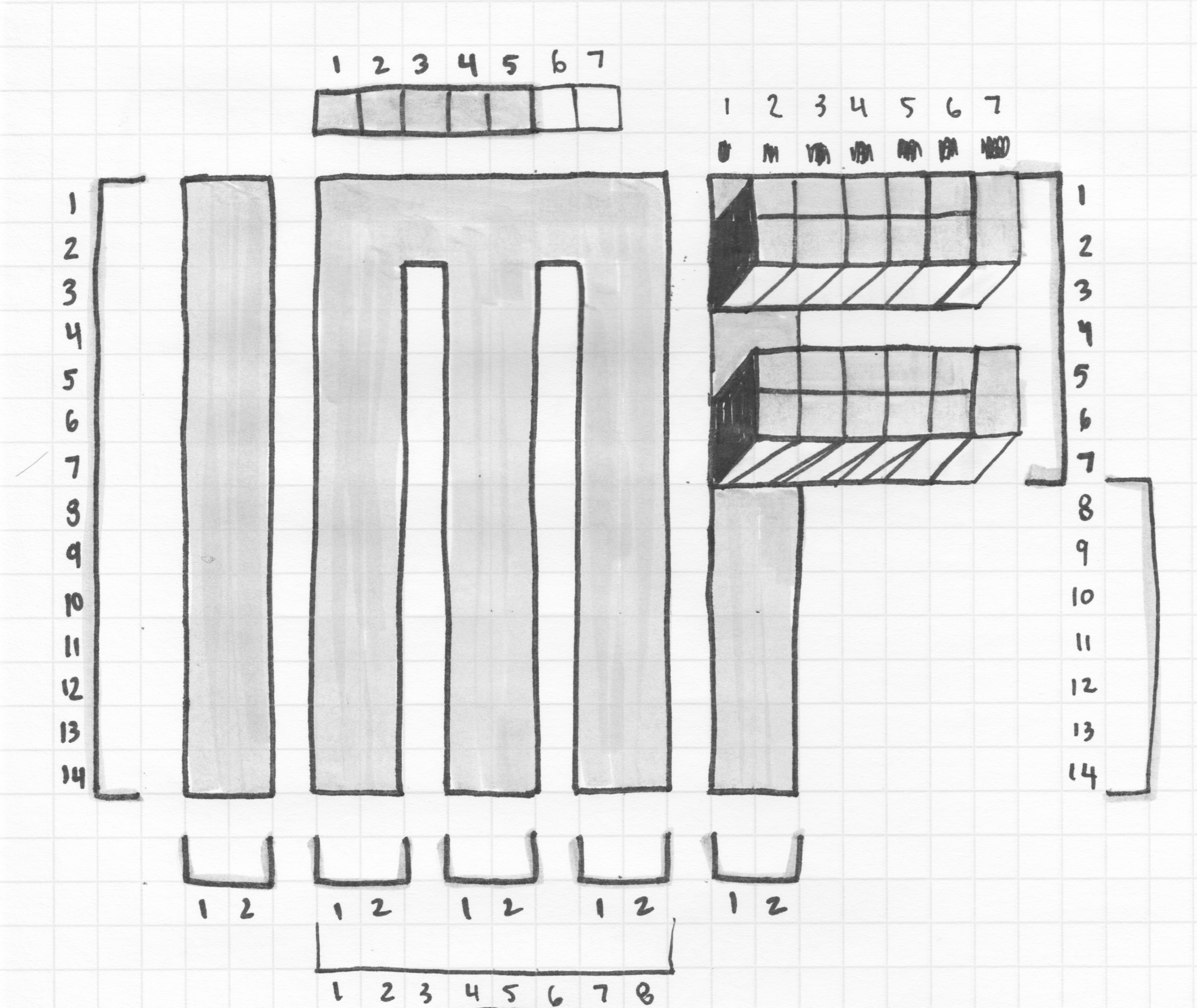
I went with a logotype with an emphasis on a dimensional equal sign that is a part of the word F in “Fund”. Ultimately, the goal is to convey stability and growth with an energetic and vivid feel with the use of color.
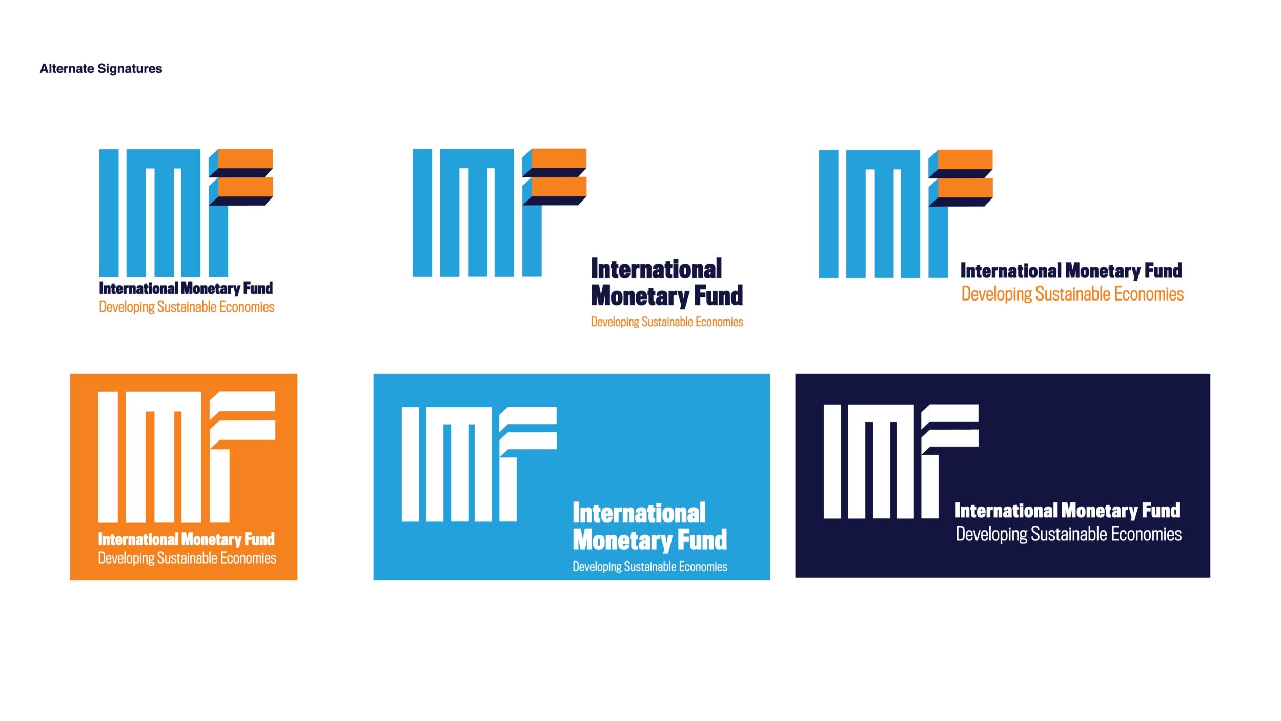
Alternate Logo Placements
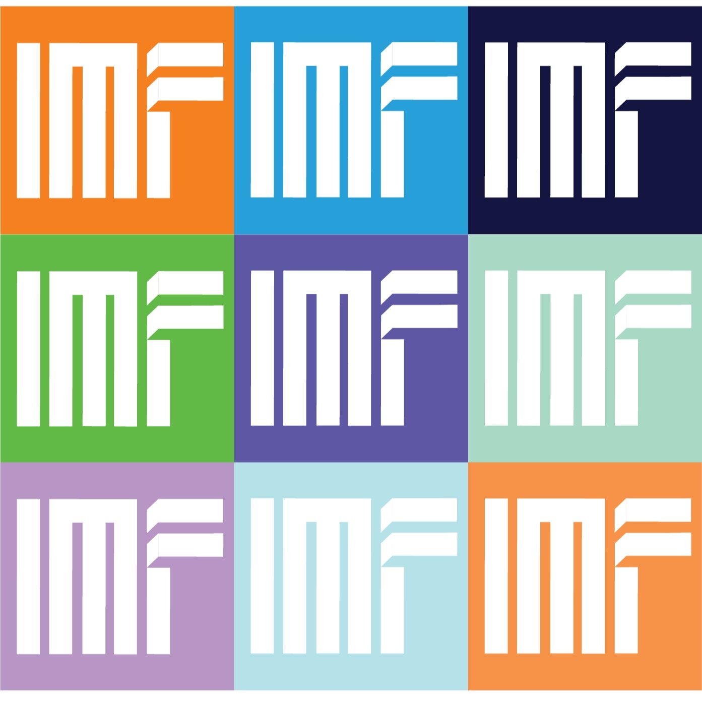
To make the rebranding more flexible, I created some alternative brand signatures, and further included a playful, vivid and deconstructed use of them through the implementation of color.
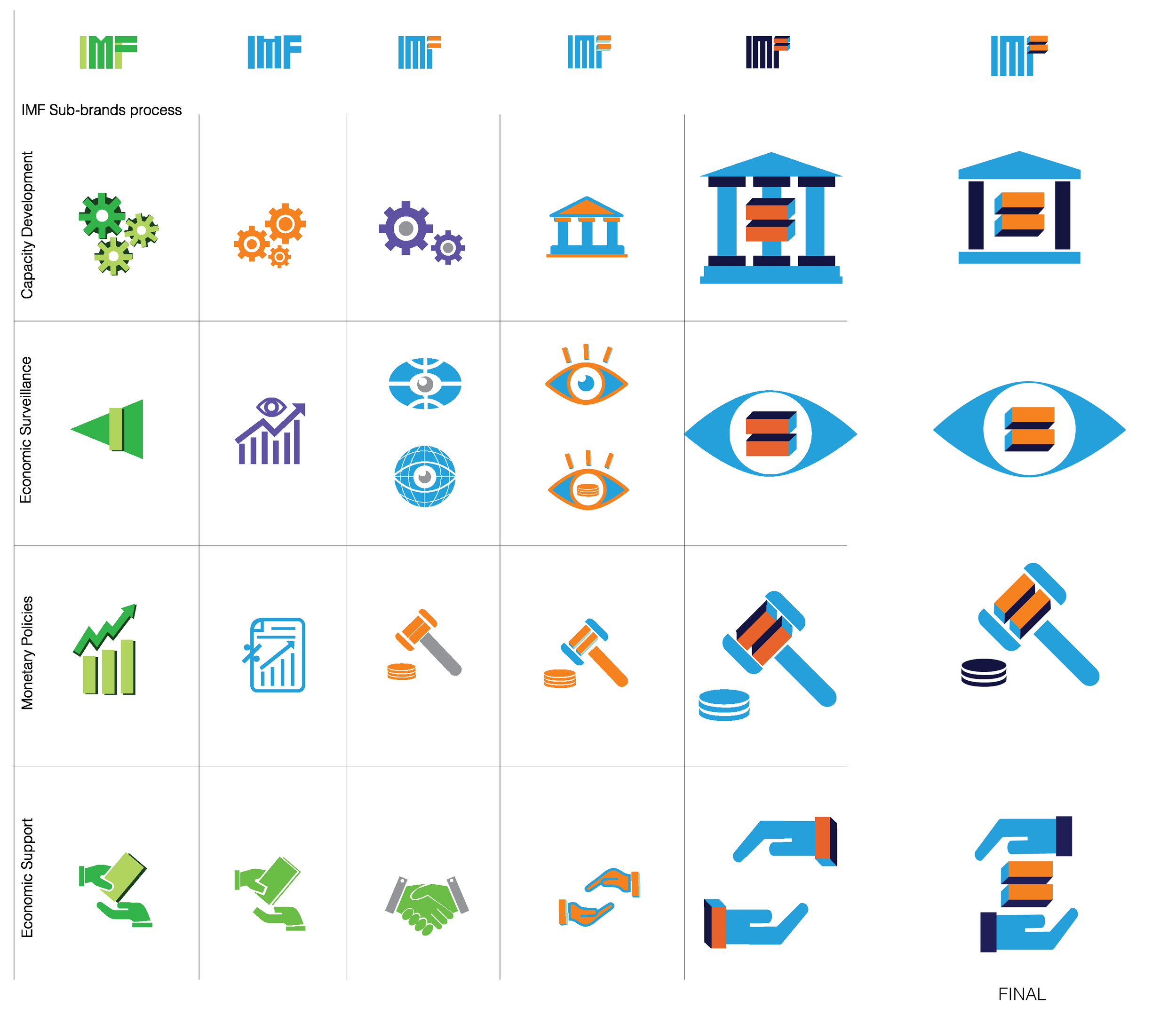
Initial Sub-Brand Sketches & Iterations
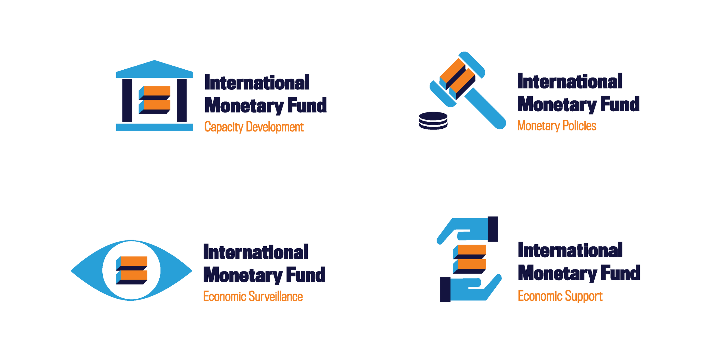
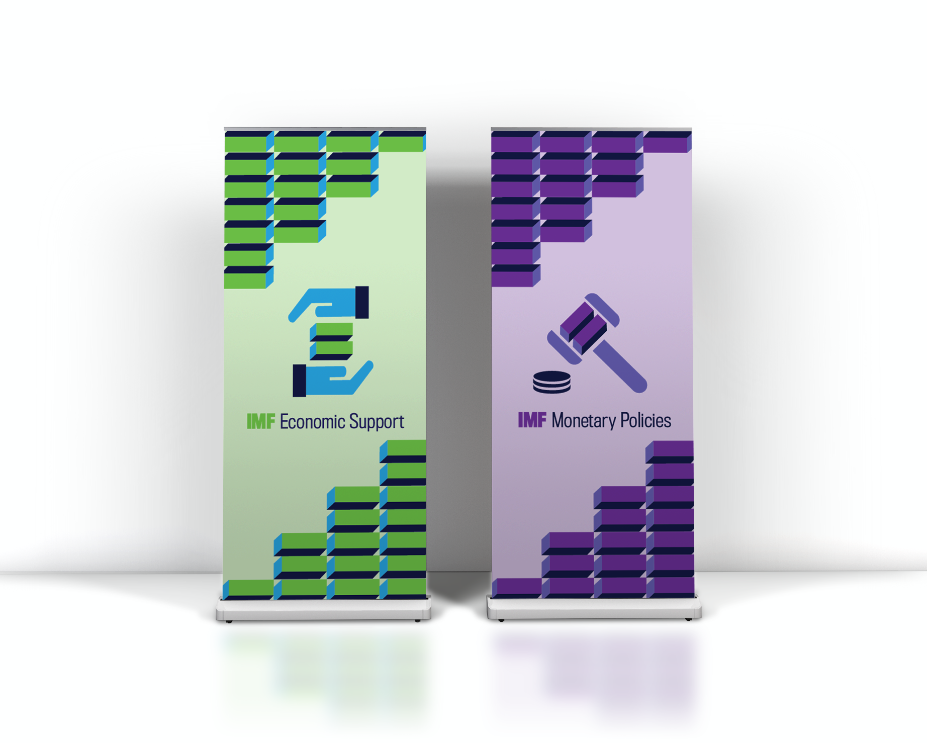
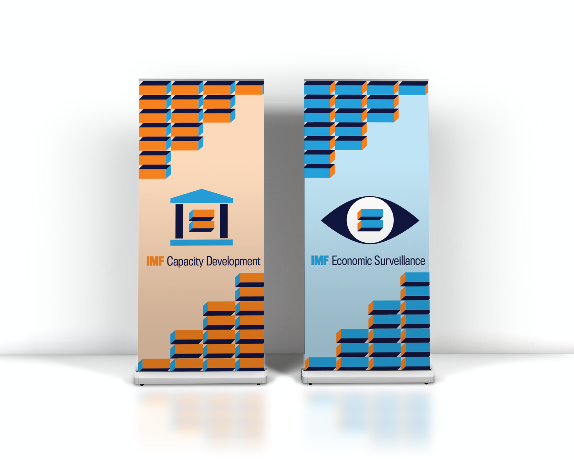
After glancing at IMF’s website, I narrowed down a bit of what they do to four sub-brands: Capacity Development, Monetary Policies, Economic Surveillance, and Economic Support. Now that I had the sub-brands in mind it was time to create visuals to represent them. It was important to not stray away from the newly rebranded logotype, so I implemented the dimensional equal sign in all of the finalized sub-brands.
Final Sub-Brands
After some mild research, I came to the final creation of these four sub-brands that entail and highlight a little of what they do.
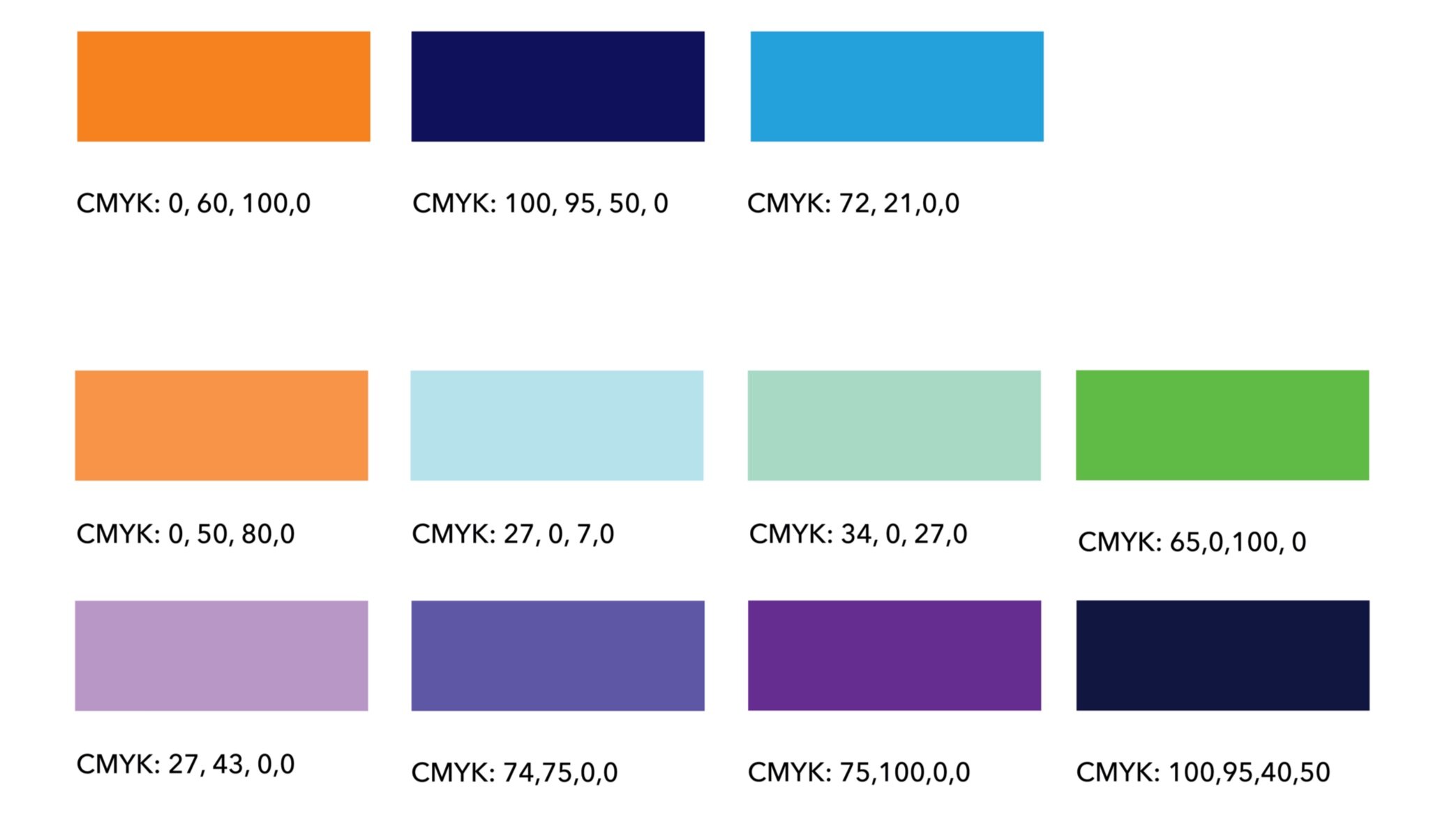
Color Palette & Visual Language
Went with an energetic Orange to bring some life to IMF. I chose secondary colors accordingly in terms of good connections, but also with some meaning behind them. Green and Purple to convey wealth and growth. Lastly, the emphasis of the three-dimensional equal sign is translated throughout the rebranding.

Brand Applications
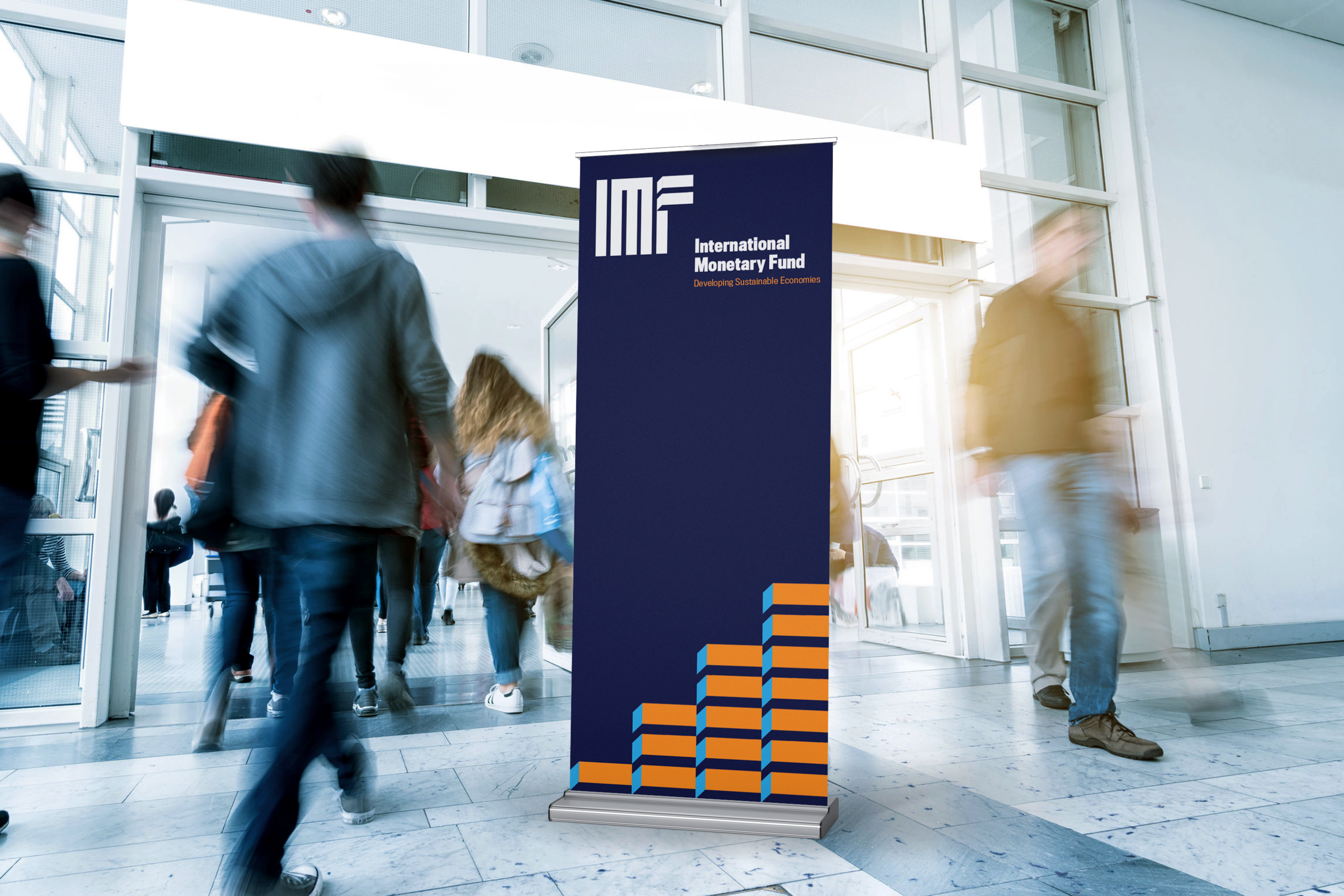
The brand applications consist of roll-up banners, a stand up banner and business cards. The roll-up banners utilize the color palette playfully while highlighting IMF’s main sub-brands.

IMF Motion Graphic
For the motion graphic, I wanted it to be playful and for it to highlight the main subbrands. Essentially to also guide people to their website and learn more about IMF.
Tools :Adobe Illustrator / Adobe Photoshop / Adobe After Effects
Role: Multidisciplinary Designer
Final Deliverables: Brand Identity, Poster, Animated Poster, Indoor/Outdoor Sign, Tote Bag and ID Badges

